UX Design Institute
Baking a fresh UI for a banking app
As part of my Professional Certificate in UI Design, I was tasked to create the UI for a new responsive banking application.
The client, a challenger brand, is looking to makes waves in the financial world and requires an intuitive app that will help them stand out from the crowd. Their tone and personality is as follows:
Playful / Using the product should be a joy for users. We’re not afraid to show some personality through colour, animation and shape, but never at the cost of being intuitive.
Clear / We’re dealing with people’s money, so we need to present information in a logical and uncluttered way
Trustworthy / Users must feel they can trust our product.
Scope of work
/ Product design (UX/UI)
/ Visual Identity
/ Design system
Date
2023
The objectives
1
Choose a name for you bank
Create a fresh new interface for a responsive banking application
2
3
Design polished user interfaces for three screens on desktop and mobile
The process
/ Moodboarding & Ideation
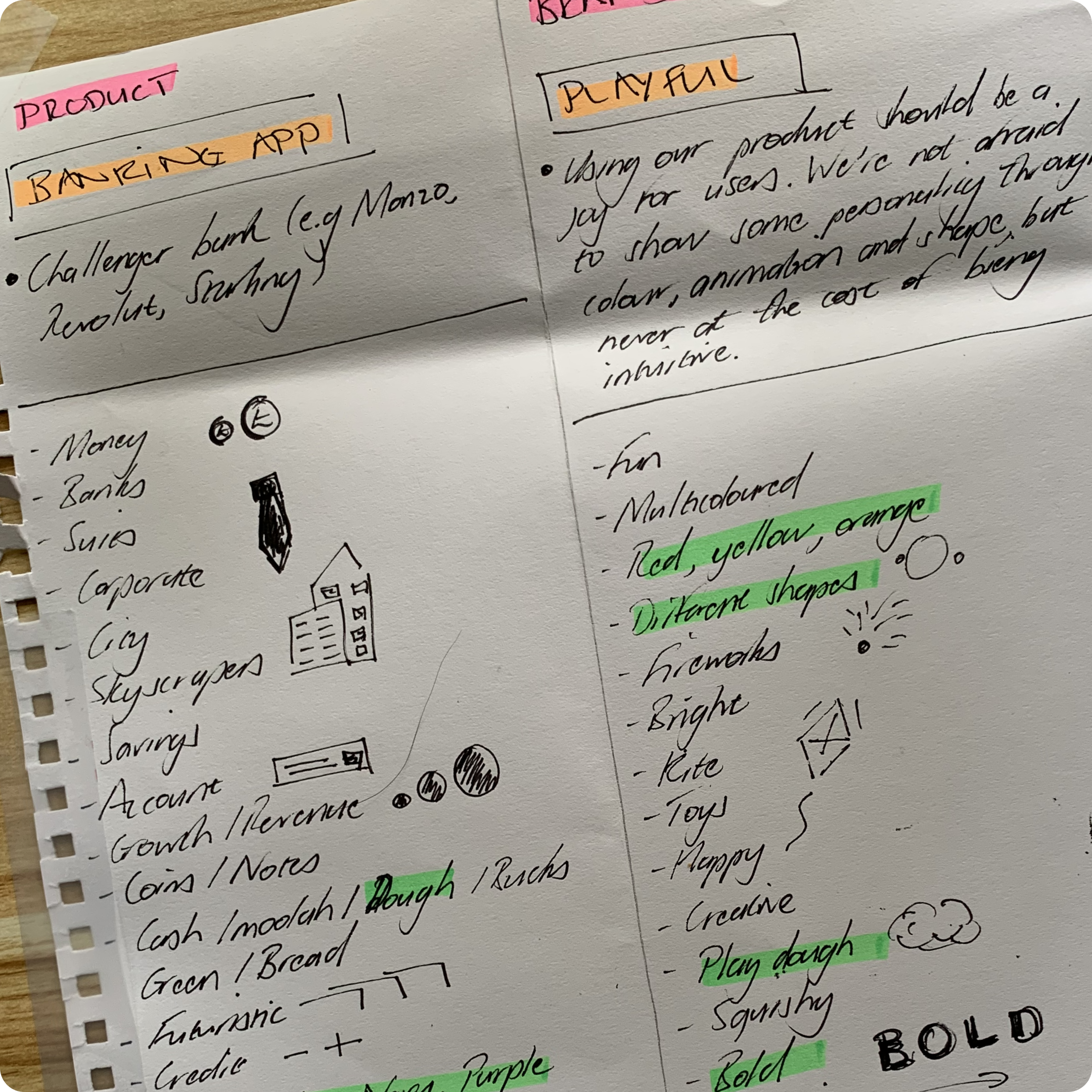
Kicking things off, moodboarding was done to gather valuable sources of inspiration including references from competitors and the market, as well as other products resonating the qualities of the brand.
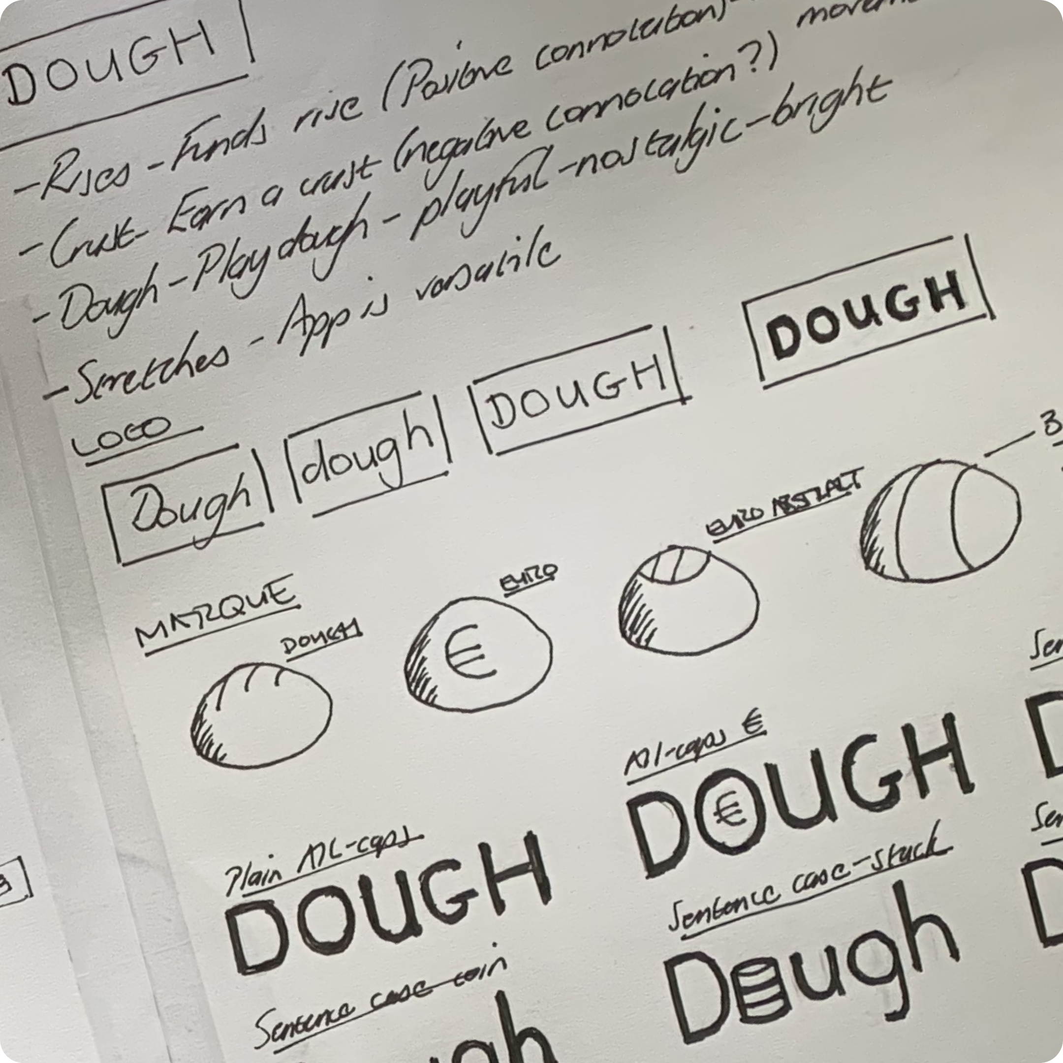
Ideation techniques such as brainstorming, mind mapping and sketching were undertaken to get the creative juices flowing and help inform the foundations of the brand identity.
/ Crafting a brand identity
Defining the brand identity meant delving in to the necessary elements for the UI, keeping in mind it was critical they were reflective of the brand’s personality traits.
Typography, colour, iconography, and imagery were among the elements explored, the culmination of which can be seen in the style tile below.
/ Grids and principles
Building on low-fidelity wireframes supplied by the client, grids were set up to give pages a rigid structure and design principles were carefully considered to guide users through the design whilst simultaneously communicating the brand’s personality traits.


The solutions
/ An identity with real flavour
Widely recognised as slang for money in the west, Dough provided me with a wealth of creative fodder.
The colour palette was inspired by the pastel tones often seen in a bakery very much in keeping with the playful personality the brand wished to convey.
Illustrations created using AI added to the playful narrative, presenting Dough in a more compelling way that set’s it apart from the crowd.
/ Designed with quality ingredients
Though not in the original brief, to ensure the designs were instinctive, intuitive, and scalable, a design system was created using the atomic design methodology.
Other than aiding consistent designs across different devices the design system streamlined my design process, allowing me to edit pages using the flexible components I’d built out.
/ A series of visual sweet treats
A series of pixel-perfect, polished user interfaces for desktop and mobile screens were designed conveying Dough’s brand identity. Included are a home screen, an accounts screen, and a spending screen.
n.b. a prototype is currently in development and will soon feature on this case study


